Dashboard Design Rules
In June, we launched the Power BI Dashboard Design Course, a great video course with several helpful resources.
One of the main interesting aspects of the course is its structure by rules.
Yes, we know that rules are boring, but we also know that designing good and professional dashboards in Power BI is not so easy without discipline.
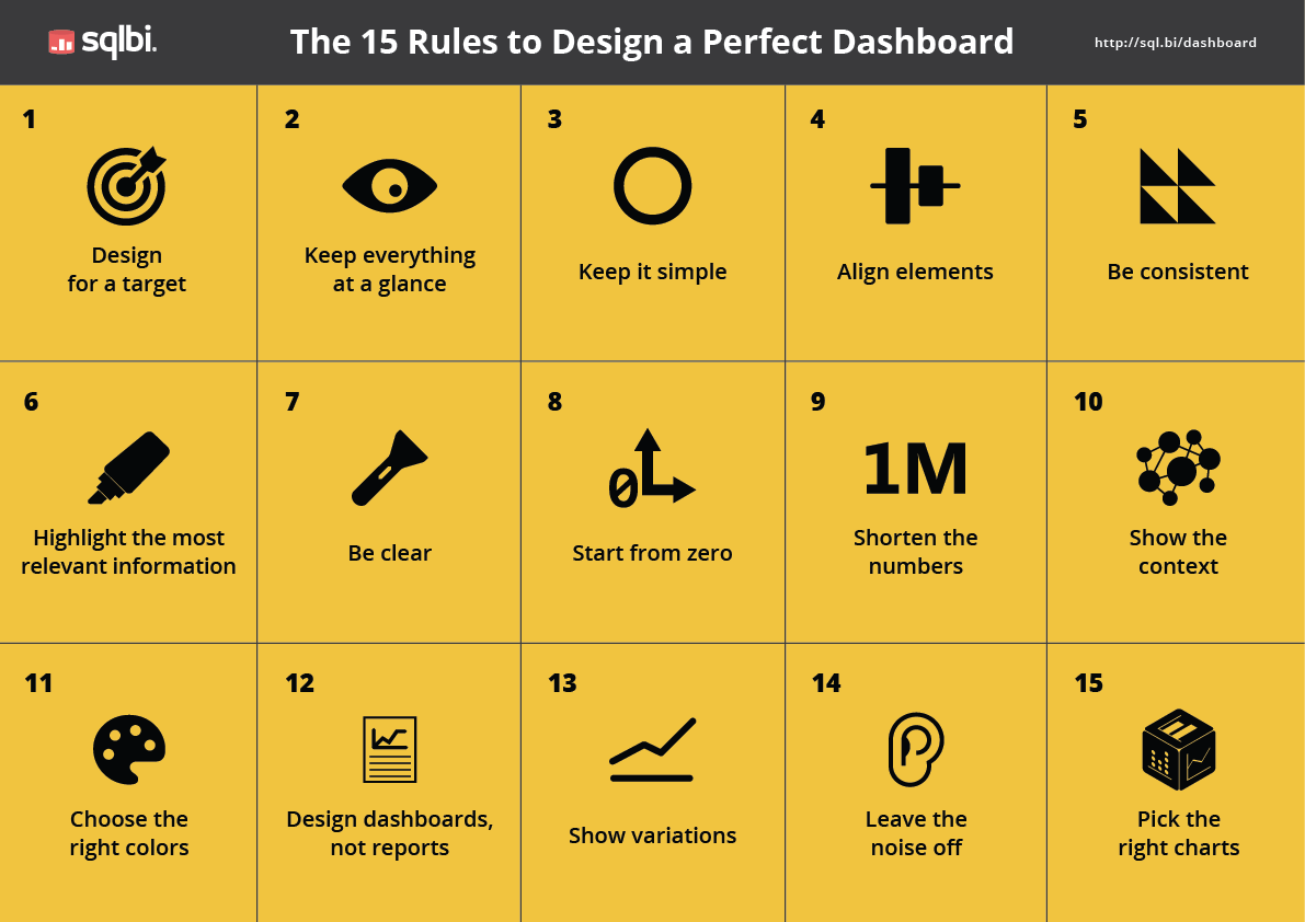
Let’s look at a brief introduction to these rules:
- Design for a target
Simple, but underestimated: don’t lose sight of your goals and target users, otherwise you will fill the dashboard with too much useless information. - Keep everything at a glance
What if your car dashboard contained scrollbars? Ouch. A good dashboard must show all relevant information without the need for touch, scrolling, or clicks. - Keep it simple
Complexity could come across as sophistication, but in reality it is just an obstacle between your dashboard and the end users. - Align elements
Who wants to design amateurish stuff? Ok, let’s start by aligning elements. - Be consistent
Is repetition boring? Not really. - Highlight the most relevant information
Your dashboard is like a page of a magazine: each location has its meaning and a different level of importance. Don’t place charts at random. - Be clear
Acronyms are bad. Legends are good. - Start from zero
Chart axes must be used consciously. Sometimes we convey the wrong message just by forgetting to pay attention to details. - Shorten the numbers
Dashboards users want to see the overall picture. - Show the context
Numbers only carry meaning within their context. - Choose the right colors
Do you know that about 10% of the population suffers from color blindness? - Design dashboards, not reports
Remember, not all the details from a table are suitable for a dashboard. - Show variations
Don’t let users do the math. - Leave the noise off
Don’t suggest relations that don’t exist. - Pick the right chart
Each piece of information must be displayed using the right chart in your dashboard, so choose it wisely.
Remember that each rule is explained in depth in the video lectures by our teachers and you can try the course for free!
They are not so boring after all, right?
And to help make them front of mind, here is a free PDF you can download and print to use as a reminder during your design activities.
Download Rules A3 (PDF)
Download Rules A3 B/W (PDF)
Have fun!